Infosystem - New corporate design and what's behind it

«A brand that is timeless and modern. Colors and fonts that carry our identity. Brands that are smart and a shared passion that unites us. Because we don't sell software, we sell the future.»
With this objective in mind, we launched the rebranding project in 2022. However, there is much more behind it than just a new coat of paint or a new logo & icon.
This year we are celebrating our 55th anniversary and a lot has changed over the past half century. When we started in 1968, there were neither PCs nor software and not even a job title for what we primarily do today. And it all started with an IBM 1401, on which our founder, Ruedi Sulzer, wrote the first simulator. That was at a time when people were still sitting in computers and not at them.
«The training is not difficult, but finding people who want to learn programming is even more so.»
Ruedi Sulzer
Founder of Infosystem AG
In the years that followed, technology has developed rapidly and our user behavior has also constantly adapted. We have also adapted to this. From individual development for the first minicomputers in the 1970s, through the first standard modules for finance, to the overall ERP performis and the industry solutions leva+ and ressys.
And yes, certain areas have also grown "historically" for us, which is not a bad thing per se. Rather, it is the art of constantly adapting to new circumstances.
This is what we have done and in recent months we have taken a close look at the market conditions, our brands and their modules. The aim was to design the product landscape in such a way that it is easy to understand and at the same time to bring the brands (back) closer to the company branding. Anyone who has ever done this themselves knows that it is not always easy to find a clear-cut rule as to why and what belongs where - and then the customer should also understand this.
By standardizing our brands, we are putting the Infosystem company back in the spotlight.
Tobias Schnelli
Head of Marketing & Sales
So we first categorized our existing products and modules according to features and purpose and mirrored these with existing customer portfolios. This resulted in a refined product landscape with corresponding definitions. This then helped us to organize the structure of the brands and, above all, the structure of the new website.
![]()
The result is a brand world that can be derived directly from the new company logo while still retaining its independence. The "tail clips", which replace the previous tiles in the Infosystem logo, are also used in a simple design and in different colors for the product brands. After all, our egg supplier customers often don't really have anything to do with the rental of heavy goods logistics and the fiduciary ERP customer doesn't have anything to do with our reservation system either.
Business framework
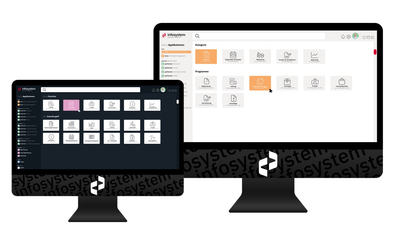
The core of the new product landscape is our business framework. All our products are based on this - even the individual developments are generally always served from this modular system and supplemented where necessary.
Website
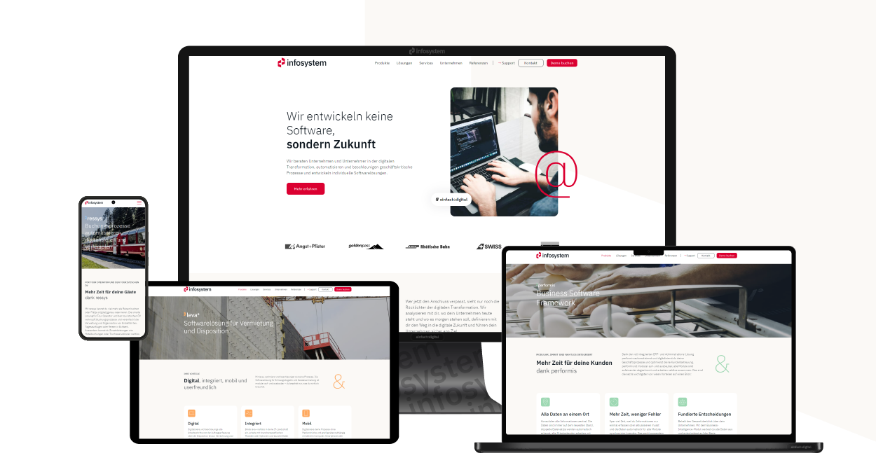
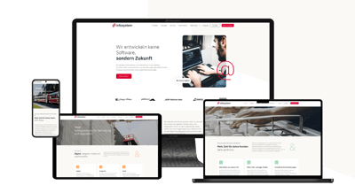
The structure of the adapted product landscape also forms the basis for the new website. By bringing the product markets back to the company brand, we have also reduced the structure of our website from four pages to one. Although the scope has increased, the complexity has not and, above all, the management effort is now significantly lower.
Having CRM and CMS in one is a huge benefit. No interfaces, no media disruptions and all reporting is always available at the touch of a button. This makes it much easier to implement and control our measures.
Rolf Kobelt
Marketing Manager
We created the wireframe on the basis of our predefined personas. This resulted in a very multi-layered website. For example, a user who is already familiar with our products will find what they are looking for directly under the relevant menu item. On the other hand, those who want to look around first can do so via our industry and application solutions. Here, industry solutions and application areas are described across the board. This also makes it clear how the modules of our Business Framework can be combined to create specific solutions.
Facts & Figures
- 88 subpages - that's how many pages the new website consists of
- 17 call-to-actions - that's how many different call-to-actions, such as "Book demo" or "Request target price", are spread across the 88 pages
- 12 appearances - this is how often our call-to-actions are integrated on average on the different pages
- 5 different forms - that's all our site needs - and each one generates a lead directly (if it doesn't already exist)
- 8 months - that's how long it took us to complete the project
Last but not least
A huge thank you goes to everyone involved. First and foremost to Julia and the entire team at Glaswerk Consulting. Then Claudio from Büro Becker for the design, Roger from Schreibwerkstatt for the copywriting, Sarah from seologen for the optimization and IXTENSA for the programming. Without you, this would not have been possible and we would say - admittedly somewhat self-deprecatingly - that we did a really good job.


